
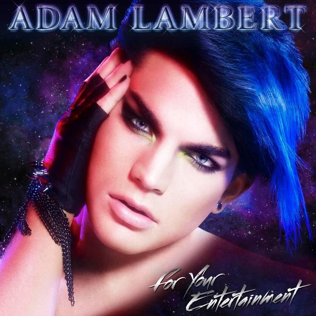
When I first saw it, I thought it was fan art done in an '80s fantasy style (unicorns, planets and stoner paraphernalia come to mind) because of the airbrushed plastic-smooth complexion, the glittery background nebulae and the simplicity of the composition. Someone had skillfully created the image from scratch for a remarkable likeness which was more sophisticated than all the fan creations I'd previously seen. I then realised it was a photo but couldn't recall which one was used as a base before realising it was new and it hit me that this was the album cover. Yes, I'm that slow!
 Unsurprisingly, I love the electric blue hair and the colour scheme, which fits in perfectly with this blog. Adam went for a gender-bending androgynous look, a prettier David Bowie, a softer Annie Lennox. When he's been dressed up before, his look has never been as feminine as this. Even when he's gone for the pretty, there's still plenty of masculinity. For example, in the photo used in one of my attempts at artwork some time ago (see the similarities?), he's all glammed up but still retains a patch of glittery beard. I'm not a fan of the pose which I find a little too passive, and coupled with the soft focus is like the result of one of those 'free' makeover adverts that charge ridiculous amounts for the photos. I would have liked to have seen him with a more animated expression in a composition that pushes the envelope more. I don't like the over-used airbrushing but I understand its contribution to the other-worldly ethereal android look, like he's a CGI Final Fantasy character. Although radiant, he just manages to escape looking like a cosmetics advert thanks to the cold colours. His shoulder just looks strange, very 2-D. I do love the fierce stare enhanced by the dramatic eye make-up, and where he pulls his eye slightly taut changes the shape of his face making him look even more feminine. Those and the dreamy alien glow remind me of Princess Aura (below) from Flash Gordon. There's no denying that it's a bold image and Adam looks beautifully bewitching. But how well does it work as his first album cover?
Adam described the album sound as being "as if a '70s time-capsule blasted off into space and you're watching it through a holographic filter." The artwork does indeed embody those words with a very kitsch glam retro feel. It complements the rather conventional title of the album by paying homage to some of Adam's influences which some bloggers have pointed out. The fundamental issue I have with it as a cover is, although it's beautiful, it looks too dated and could easily pass as an old vinyl cover from the early '80s. Albeit not as important in the digital age, it's still supposed to help establish the image of an artist but there's nothing new and the typography incorporated looks like it's from the cheesy side of that era. It makes me think that the album is all retro-glam, which may perhaps be correct, we don't know yet, but I'm disappointed by the distinct absence of modern elements being represented. It lacks fun, doesn't tell me it's fresh, nor does it tell me it's something completely new and monumentally different, which is what I've been led to believe. It's soft rather than hard and edgy and it conflicts with my personal expectations for the album. But that's part of the problem - Adam is so versatile and spans such varied genres that we all have different expectations and it's hard to find an all-encompassing cohesive image to please us all.
The artwork, like the title, is only a component of the album. In the way that the cover's references make up for the title's lack of them, only when I hear the album will I really be able to judge how effective it is. Maybe Adam warps retro through his holographic filter, making us see something modern and futuristic. We'll just have to wait and see. Judging by your comments, it's very polarising and that in itself has generated plenty of buzz. It still represents Adam's view that if you're pleasing everyone, you're playing it too safe. I'm happy that the album cover is not a safe choice. It is distinctive and challenges people's discomfort and acceptance of feminine beauty in men.
Well, you already know how I feel about this cover. AHHHHH! Great comments from the blogs....Elvis in drag, rainbow brite on meth. WTF???? OMG.
ReplyDeleteLove it! It's wickedly angelic and otherwordly seductive.
ReplyDeleteCan't wait for your analysis!
AD
The first flashback I have from the cover, is Adam's T shirt worn at Upright Cabaret. It reminds me of David Bowie.
ReplyDeleteAs an artwork, the cover is beautiful. It is magnetic, powerful and memorable. As someone pointing out in IDF, if you view the cover diagonally, you will see that the pink side is more feminine while the blue side is more masculine. It is unique and something people easily grow to like.
As something representing Adam Lambert, I think Adam deserve more credit than that.
I guess people nowadays are so drawn into perfection. Things are altered and erased as they are not good enough. Even if this is how it's done in Hollywood, I still wish to see more Adam in every photos of his, cover or not cover. Because, he is just beautiful the way he is. Thanks Adam Bombed for the post.
~k65535
Adam Bombed - Oh God he went with androgyny - I am beside myself now waiting for this glittery man/woman to sing to us. My eyes are feasting.
ReplyDeletePS I can definitely feel an update to your blog's artwork. Nicole
Lynn, what a strong reaction you have! What do you specifically dislike about it? Is it the way Adam looks? The style of the design? Feel free to elaborate some more!
ReplyDeleteAD, it's definitely other-worldly and so different to the results of any photo shoot we've seen so far that it came as quite a surprise.
k65535, Thanks for bringing over that observation. I wonder if it was intentional or whether it's us fans over-analysing. I agree that it's very memorable and would stand out on a shelf. Like you, it reminds me of Bowie but I think its effect is the same as that which Adam described in a confessional of seeing Bowie's Diamond Dogs album cover for the first time and being drawn to it.
Nicole, yes the cover makes me even more intrigued about the music. I'd been considering a revamp for a while as all the photos are quite old.
Adam bombed; I was expecting something sexy and flirty - not a "Lisa Frank" design. It's photo-shopped to death. His shoulder looks out of proportion with head. The feathered blue hair looks like a wig. His face shows no expression. Even the title doesn't fit the photo. It's all too bizarre, confusing and Xanadu-esque. I want Adam as a human with flesh and bones, not an alien.
ReplyDeleteThis is my first Adam disappointment...I think he is trying way too hard to get a reaction and not letting his voice/music do the impressing. Instead, it looks like unicorns, fairies, and martians will be sauntering into the background at any moment. This photo is a sterotype of the glam-rock days and I believe this could set set himself up to become a parody. He hasn't yet performed enough in the glam-rock genre to take a chance on a cover like this....maybe in a year or two.
Having said all this, I (of course!) still love Adam. I look forward to the songs. But this cover is not the Adam I want in my CD holder!!!
Sorry. I am happy though that people can appreciate it. I guess I am one of those who just doesn't get it.
Adam Bombed, looking at the nicely splitted version posted on IDF, yes it is intentional. But I think the splitted version may be done by more than a fan. The timing of the leak and the accuracy of the split, given there is an overlapping between the two pictures, are too perfect somehow.
ReplyDeleteSidetrack, Adam had leaked more song titles out yesterday. There is one call Broken Open (:D) and one called SOAKED. While people were all excited about who the song writer was, surprise, there is a leak on a demo.
Here comes the DEMO version of SOAKED written by MUSE:
http://www.youtube.com/watch?v=ONkTCzxF_xM&
Lynn, yes, I agree that it's not a very well executed and a bizarre choice for the cover. But I think the tweet about 'getting it' was a little patronising. For me it's not a case of understanding it or not but a simple matter of taste.
ReplyDeleteFor some people the title of the album evoked images of old-fashioned crooners. But seeing the album has changed all that. Some may think that the album cover is naff but I think opinions may be swayed after hearing the music.
I'm trying to keep an open mind until I have the whole album and can put everything into context. The music or lyrics might contain self-ridiculing snark, something really kitsch and tongue-in-cheek which would give us that 'Eureka!' moment and it would all make sense. Then the irony of the cover would become obvious and our appreciation of it would change. That's what I'm hoping for anyway!
k65535, I'm so excited about the music - we're nearly there now!
I think the correct lyric is "soft and sweet", not "awfully sweet".
ReplyDeleteHave you seen the 'other' cover of For You Entertainment? The one with the hand with rings on fingers, the rings chained together and the whole hand covering the face. This cover has more to read into it. Chains = binding, rings = encircling, hand over face = hidden, face peeking thru fingers = showing glimpse to the world.
ReplyDeleteSummary = I'll show you enough, but don't bind me.
http://www.google.co.nz/imgres?imgurl=http://2.bp.blogspot.com/-IlNdsVcFVLQ/Txs35lFhHII/AAAAAAAAAFU/uHg-oJRwUPk/s1600/Adam%2BLambert%2BUK%2BFor%2BYour%2BEntertainment.jpg&imgrefurl=http://reviews-and-info.blogspot.com/2012/01/adam-lambert-for-your-entertainment.html&h=500&w=500&sz=53&tbnid=RG3J_euFi9jszM:&tbnh=95&tbnw=95&zoom=1&usg=__Xsey4WBc2zg81mGBY97eSKD8KsU=&docid=wCVog2eK1YIbrM&sa=X&ei=WOJuUqS9AsiwkgXt-IHoCQ&ved=0CE0Q9QEwBQ